This is a branding project for a local young film programmers group, Reel25. The project included designing a distinctive logo, social media templates, and a comprehensive set of brand guidelines to ensure a cohesive and adaptable visual identity across all platforms. The design aimed to reflect their passion for film while maintaining a professional and engaging presence
Reel25 is a dynamic collective of young film programmers dedicated to curating unique and engaging film experiences. With a passion for cinema, they organise film screening events that bring communities together to celebrate the art of storytelling. Through their work, Reel25 not only fosters a love for film but also empowers its members with practical expertise, creativity, and teamwork, making it a vital platform for aspiring creatives in the world of film and events.
After meeting with the clients, it became clear that they wanted a logo and brand identity that reflected their core values—a collective of young film programmers dedicated to providing a platform for underrated and underrepresented films. They sought a fun and quirky aesthetic that aligned with their vibrant personality and mission. The team had an existing logo they liked and wanted it to serve as inspiration for the new design. With this in mind, the brand development process began, ensuring that the final identity captured their vision while maintaining a cohesive and engaging visual presence.
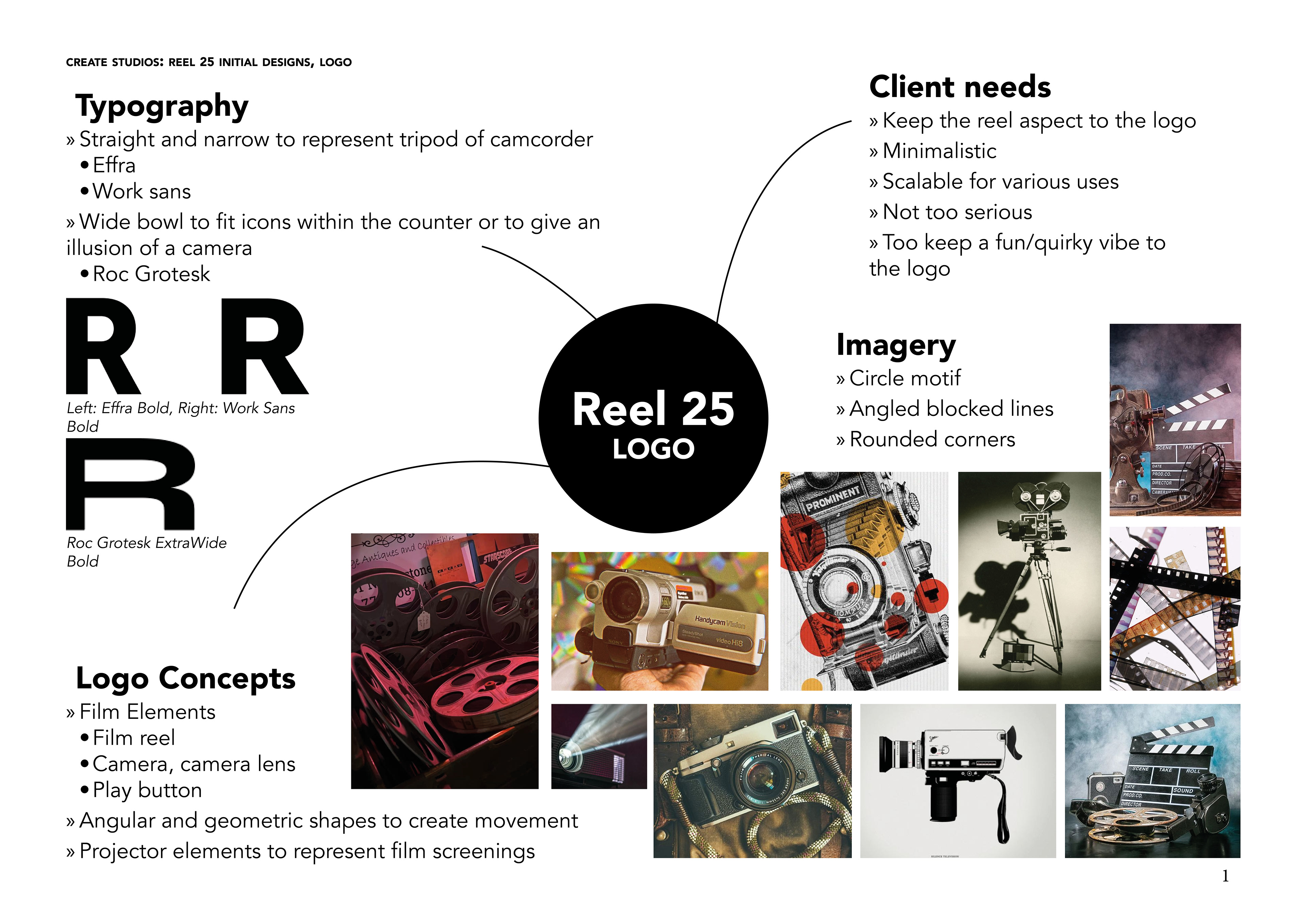
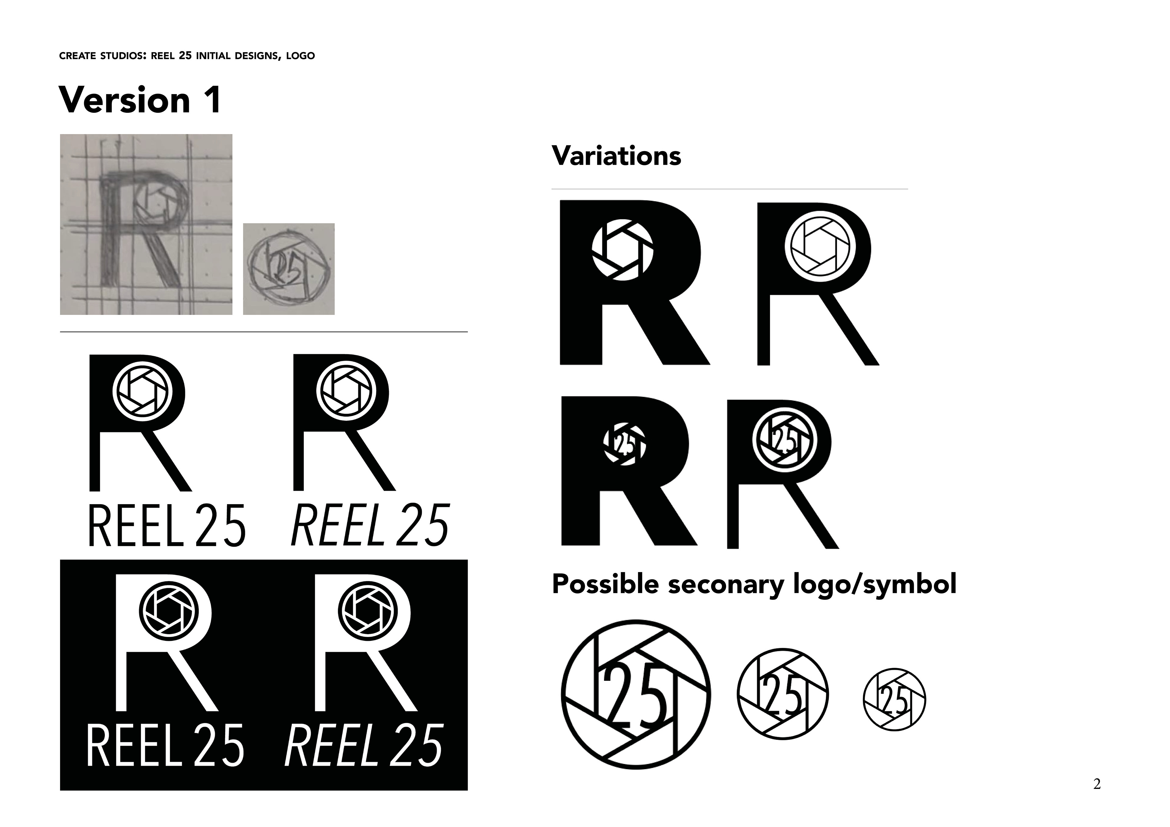
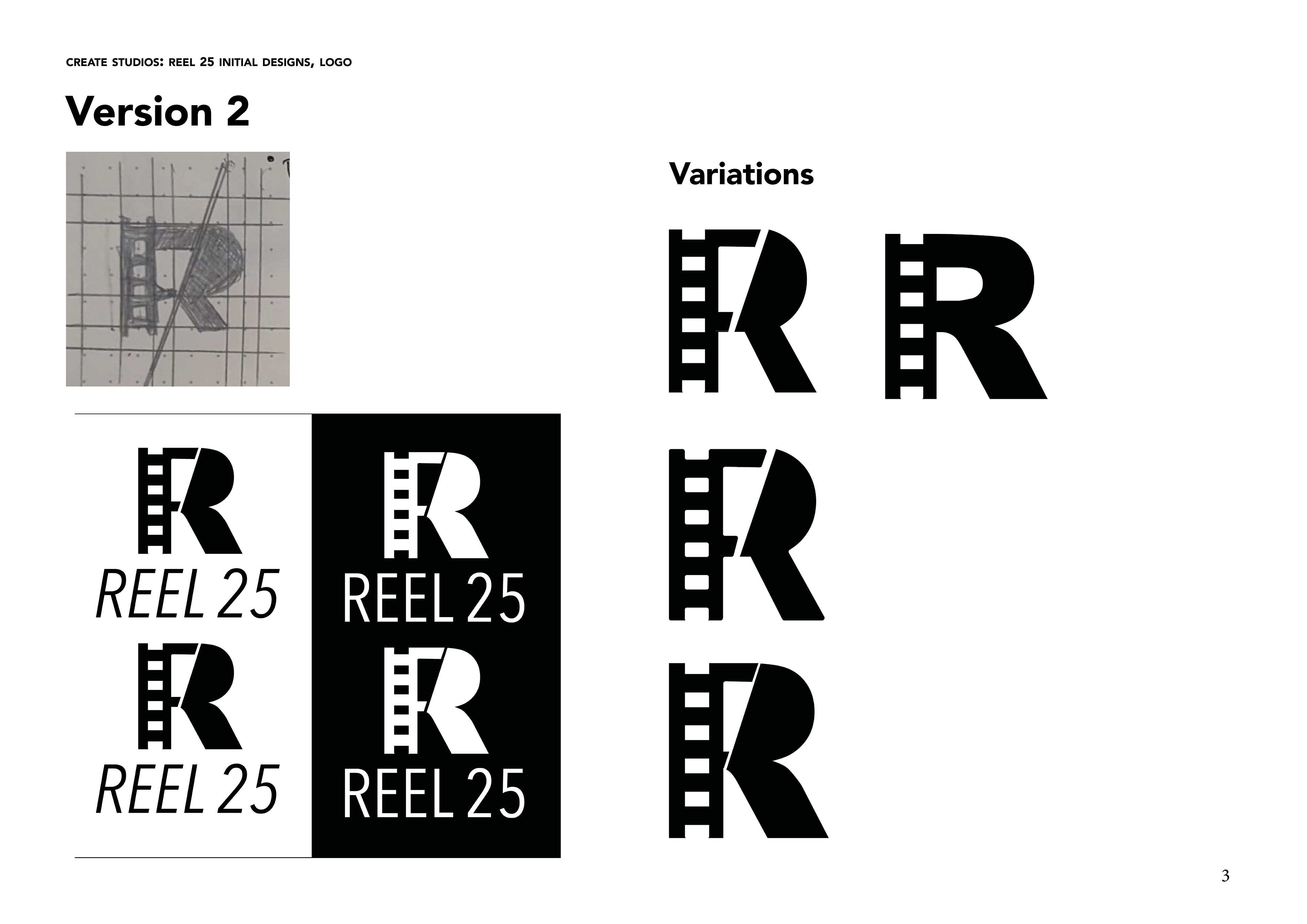
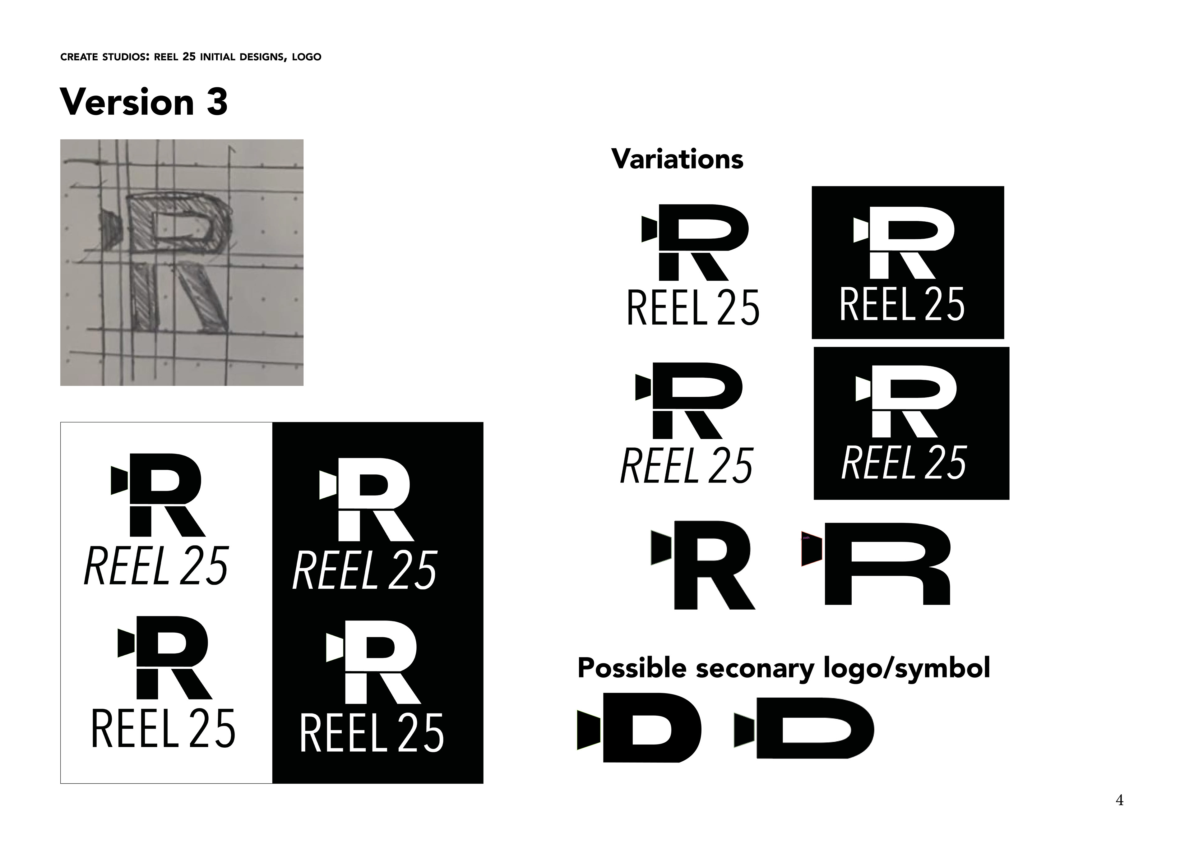
Several design iterations were explored before finalising a logo that incorporated key elements from the team’s original concept, particularly the film reel motif. The selected design achieved a balance between the seriousness and playfulness that Reel 25 sought to convey.
To establish this balance, a typeface with sharp corners was chosen to introduce a sense of professionalism, while the integration of a film reel strip within the letter "R" added a welcoming and approachable quality. Various icon illustrations were tested within the stem of the “R” to refine the concept, ultimately resulting in a design that seamlessly incorporates multiple film-related elements—namely, a film reel strip and a clapboard.
The film reel strip replaces the stem of the “R,” with the letterform split diagonally to represent two key aspects: the open space created when a clapboard is in use and the angled striped pattern typically seen on clapboards. Additionally, the enclosed counter of the “R” is shaped to resemble a projector lens, reflecting the intimate “sofa screenings” hosted by Reel 25.
The chosen typeface, Arial Black, brings a bold yet playful character to the design. The curved leg of the “R” enhances the fun and inviting nature of the brand, aligning with the team’s request for a logo that maintains a lively and engaging feel.
Rounded corners were incorporated to complement the letterform, ensuring a soft, approachable aesthetic. This design decision reinforces the light-hearted and dynamic personality of Reel 25, avoiding an overly formal or serious tone.
With the logo finalised, a comprehensive brand guidelines were developed to ensure consistent use of the logo and brand elements. The document provides clear instructions on logo variations and their proper usage, enabling designers and volunteers to maintain brand integrity.
